Tsakiris Chips - Packaging Revitalization
The Challenge: Tsakiris is the oldest Greek potato chip brand in the country. Although the brand enjoys a strong positive image. The Coca Cola 3E company bought Tsakiris, with the intent to turn around the company and aggressively tackle the Greek and the Balkan markets. Part of their overall strategy was the complete re-design of all packaging. The Tsakiris potato chip packaging was extremely old fashioned in that it carried just the Tsakiris logo, in large type and an unrealistic potato illustration. Packaging popability on shelf, was a critical prerequisite to be addressed in the packaging revitalization.
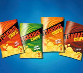
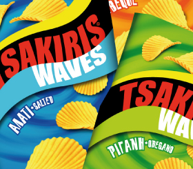
The Solution: The first step was to define the brand’s core values. Product purity and goodness along with the trend ness dictated by the target audience’s psychographics and the product’s consumption patterns, shaped the branding strategy and Brandessence’s creative recommendations. Tsakiris, “chips that captivate your senses” became our motto and its visual representation our design challenge. The swirl came to represent “being captivated” and “taken away”. Similarly, the product illustration aimed at creating the most realistic mouthwatering chips possible. In addition, an award seal was created to effectively communicate the product’s high quality and achieve consumer trust. The Tsakiris logo was re-designed, but its black background, although an unusual color for the food category, was retained because it had equity, but most importantly, because it drove differentiation on shelf. In fact, the new Tsakiris packaging is the most differentiated pack on the chips shelves that exhibit a plethora of bright colors. In the first year of the new packaging’s launch, Tsakiri’s sales grew by 21.5%.