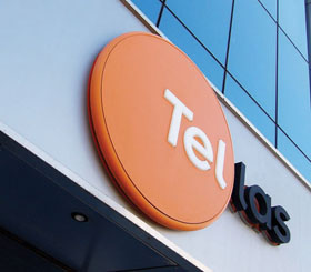
Tellas - New Brand Development
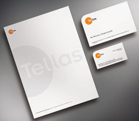
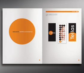
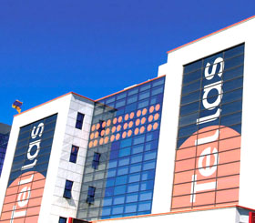
A brand is born! From the conception of the idea to the receiver of your fixed telephone. Tellas – Branding from Brandessence / CBX One of the largest telecommunication companies in Greece Name: Tellas Simple, modern and memorable Godmother: Brandessence / CBX Developed the branding strategy, the name, logo and entire brand image Parents: The Power Public Corporation of Greece and Wind, one of the leading private telecommunications companies in Europe, established a new telecommunications company DNA: Reliability, cutting edge technology, approachability and Greekness Name Origin: Tellas = Telecommunications + Hellas A large telecommunications company that “listens” to all Greeks A strong company with a strong name and a clear vision for the future: to focus on its customer’s needs Signature: Powered by DEI Color: Orange and Black Orange for approachability, familiarity and communication Black for strength, modern style, size and innovative products Look: Logo: Circle. A simple and clear symbol, with longevity and durability. Clear and readable to all. Familiar to all.
House Style: The company’s look & feel. The circle repetition in an even geometric layout works as a canvass. The house–style brings the brand to life and strengthens its personality. Character: The circles represent the optic fibers upon which the company’s technology is based. The personality developed is communicative, open, harmonious and approachable. The corporate identity goes hand–in–hand with the corporate culture, projecting the power and pride of a strong company with a brilliant future. Other Characteristics: All points–of–touch have been branded. A nomenclature system and names for all products and services, have been developed. A branding video, the websites look & feel, all corporate identity applications etc. have also been developed. In order to protect the brand’s image and maintain consistency in its applications, a Corporate Identity Manual has been developed.