Sarantis - Corporate Identity Revitalization
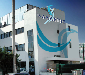
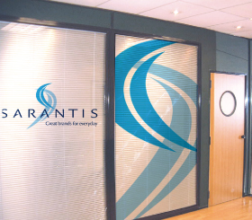
The Challenge: Sarantis, Industry of Cosmetics, a greek leading company in the cosmetics and household product categories, had entered a new era of growth and expansion. The Sarantis new era and the company’s vision had to be communicated to both internal and external audiences via a new and revitalized corporate identity. The new Sarantis face had to accurately represent the company’s brand essence and also differentiate it from the international competition it was now facing in the new markets.
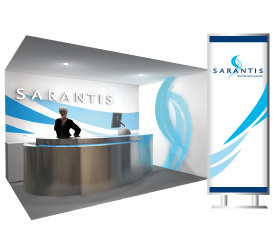
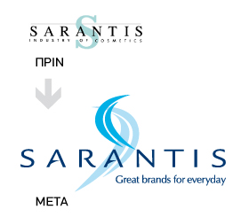
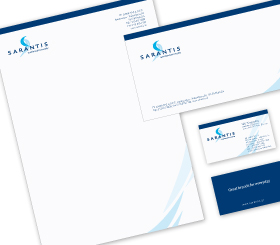
The Solution: Brandessence / CBX implemented a comprehensive corporate identity program. The goal was to strengthen the brand’s image domestically and internationally. The corporate logo was redesigned and the brand’s house style (look & feel) was developed. A new tagline that replaced the “Industry of Cosmetics” descriptor, was added to the corporate logo. Various corporate identity applications were designed and a video presenting the new corporate identity and the Sarantis vision was developed. The new Sarantis corporate identity retained the old identity’s corporate colors as they had gained equity over the years. A new branding element/symbol was developed and replaced the traditional S of the old identity. The new symbol, the wings, symbolize the new Sarantis era. They are the wings of change, the wings of progress. The brand’s house style is based on the wings and aims at leveraging their communication power. The new corporate tagline Great Brands for Every Day, is linked to the corporate logo and has become the corporate signature. Research has shown that the Sarantis new identity is modern and elegant and although quite different from the old identity, it is not disconnected from the past. Instead, it represents a company with history and stature.