Papoutsanis Aromatics - Packaging Revitalization
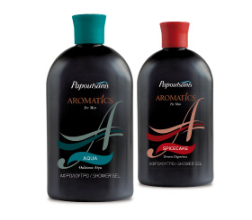
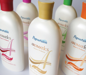
The Challenge: Papoutsanis, one of the leading and oldest Greek soap making companies, retained Brandessence / CBX for the re-branding of its primary line of shower jells and body creams, Aromatics. The Papoutsanis Aromatics packaging was in an easy to use structure, which however, had an outdated and old-fashioned look. Additionally, the label of the packaging was using different tones of the same colors, making the designs elements difficult to distinguish. Further, each SKU carried a different color structure/container, lacking a family look and thus diminishing the brand’s impact on shelve.
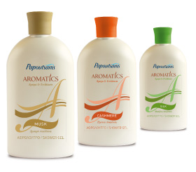
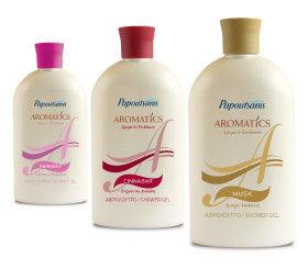
The Solution: A new structure/bottle was designed, maintaining the basic shape but, also modernizing it and bringing it up-to-date. A more modern and easier to use top/cap was also utilized to further evolve the container. The new shape/container, allowed the Papoutsanis company to continue using its current packaging machinery, which was also a design pre-requisite, and at the same time develop within its budget, a modern container for its Aromatics products. One color was used for all SKUs, creating a family look for the line and thus, commanding shelve space. The packaging design encompassed both logo and label design, with the objective of communicating the brand’s core value of care and by capitalizing on the initial of brand’s name, the letter “A”. The new packaging design worked synergistically with the company’s newly developed corporate logo. Branding research was conducted in order to select the design finalist and to detect design refinements in order to improve packaging communication.