Papoutsanis-Plias - Corporate Identity Revitalization
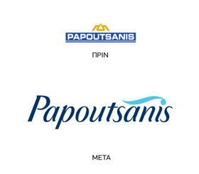
The Challenge: Papoutsanis, established in 1870 is one of the leading, oldest and Greek soap making companies. The company had changed its name to Plias however, due to the strong equity of the Papoustanis name, the company decided to bring the name back and at the same time revitalize its corporate identity.
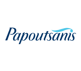
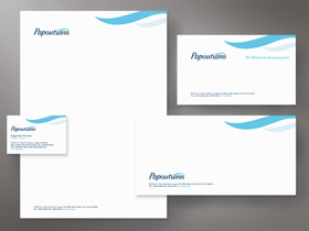
The Solution: The corporate identity was re-designed signaling the company’s entry into a new era and its focus on exports and new product development. The dark and light blue colors, were selected as the company’s corporate colors, to symbolize the brand’s Greek origins. A new modern, yet warm typeface was designed along with a symbol over the name’s “i” letter, which communicates the company’s dedication to care. Corporate applications were developed, following the Papoutsanis newly developed house-style, which works in tandem and is in fact, derived from the new corporate logo. All branding work was documented in a corporate identity manual, which provides clear guidelines regarding the identity’s usage on corporate materials as well as on product packaging.