OTENET - Corporate Identity Revitalization
The Challenge: OTENET, the number 1 internet provider, in Greece, wanted to strengthen its brand image and effectively brand its products and services.
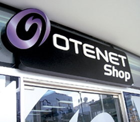
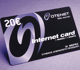
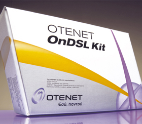
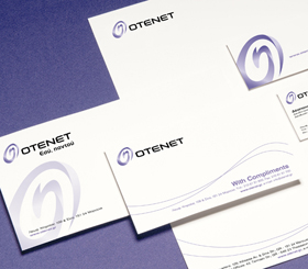
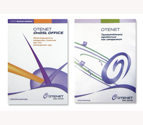
The Solution: Brandessence / CBX completed a comprehensive branding program. The corporate identity re-design was based on OTENET’s Brand-TriangleTM, which identifies the brand’s three most important brand attributes. A clear branding strategy and branding architecture were also developed. OTENET’s new corporate identity is based on an evolution of its first logo. The OTENET symbol was maintained but re-invented in order to communicate the dynamism of the brand and to link it to the internet. The color mauve was selected and used across all corporate identity applications. Customer research proved that mauve was perceived as the must appropriate color for the internet category. Importantly, mauve effectively differentiates the brand from the competition that favors the traditional red and blues. A comprehensive branding architecture was developed for the company’s entire product and service offerings. The purpose of the branding architecture was to enforce the corporate brand and at the same time allow for meaningful differentiation among critical products and services.