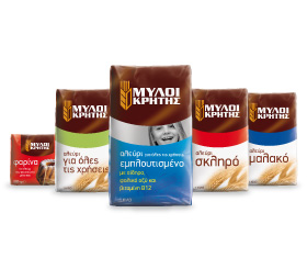
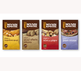
Mills of Crete Flours - Packaging Revitalization
The Challenge: Mills of Crete, an expert in flour production, wanted to revitalize the packaging identity of its range of flours and strengthen its position in the Cretan and national markets. Brandessence / CBX was hired to develop a modern, family look for the company’s flour portfolio, which included regular and enriched flours targeting consumers.
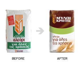
The Solution: A comprehensive family look for all SKUs was developed, while SKU differentiation was communicated via color coding and photography. The line’s use of earthy colors on all packs, further differentiated the brand from the competition on shelf. The original brand logo was maintained but placed prominently, to aid consumers in easy brand identification. The graphic element of the wheat was used for the basic line, to emphasize the origin of the flour and to show its natural and healthy qualities. For the enriched flour SKUs, photography was used, in order to effectively communicate the use of each product. The result is, a high differentiated from the competition, modern and fresh brand, which is natural and approachable to modern consumers.