Limassol, Co-operative Savings Bank / Cyprus - Corporate Identity Revitalization
The Challenge: The Limassol, Cooperative Savings Bank is the largest cooperative bank in Cyprus, founded in 1946. It has since merged with other cooperative banks and grown. It was in need of a new, modern look, to represent its growth. A critical objective for the new identity was meaningful differentiation from other cooperative banks in the region.
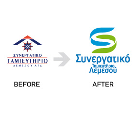
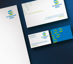
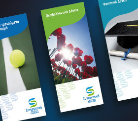
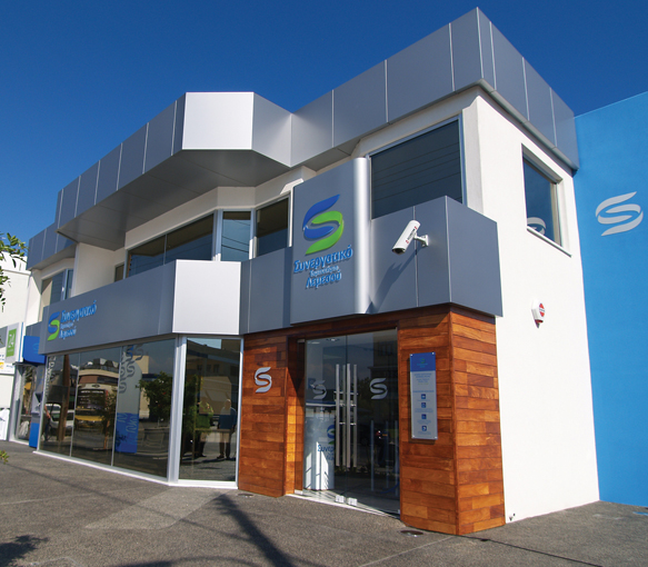
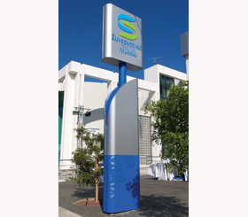
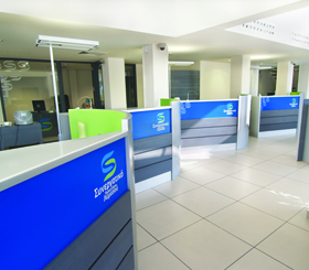
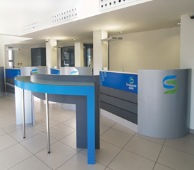
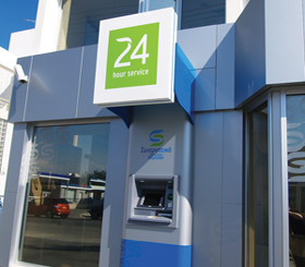
The Solution: A comprehensive color study was conducted, in order to determine the colors available to build differentiation from other coop banks in the Limassol region, but also not loose the heritage and recognition of the Limassol Cooperative brand. The spirit of cooperation is the heart of the brand’s value system, and was an important driver in developing the new identity. A “curved” initial letter S which represents cooperation, care and interaction was designed and became the identity’s focal point and key trademark element. All identity applications were developed to ensure a unique brand experience. Importantly, the organization’s branches were completely redesigned and refurbished based on the brand’s new identity and on the Capital letter S, which in the case of the braches connotes “easy come and easy go”. The stores have been specifically designed to ensure easy entrance and easy and quick exit. Delays and long inconvenient lines have been STLs problem for many years. The new identity thus, presents a new image and also sets out to solve a practical problem by leveraging the symbolism of its logo.