Deddie
The Challenge: DEI, decided to open a new company that will manage all different types and companies of energy providers. The acronym DEDDIE was selected as the new company’s name. A comprehensive branding program was required in order to build the new company’s brand. Brandessence was awarded the project. The new brand Identity should be fresh and modern.
![]()
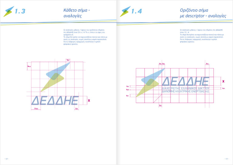
The Solution: Following the development of the branding strategy, Brandessence identified the 3 most important attributes as composing DEDDIE’s Brand TriangleTM , electricity brings buildings, homes and all areas to life, DEDDIE has the technical knowledge required to do the best job possible given its heritage, DEI and is of course very reliable, a value necessary to be in the category given electricity’s importance to life. At the same time the new corporate identity should communicate stature, as this value is critical for companies in that sector of business. The two adjoining triangles designed by Brandessence, compose the brand’s logo are representing the connectivity between the client/customer and DEDDIE. They are also a modern and different interpretation of DEI’s Lightning symbol in its logo, that indirectly communicates the new company’s heritage. House-style, applications, building signage and finally a detailed corporate identity manual were developed, in order to ensure the corporate identity’s effective implementation.