Camel - Packaging Revitalization
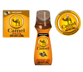
The Challenge: Camel, a Greek 70 year old shoe polish brand and a market leader was in need of bringing up-to-date its much recognized packaging and revitalizing its overall image. Re-branding a market leader is always a big challenge. Especially when a packaging has gained the status of a “cult” brand in consumers’ minds as was the case with Camels’ tin paste container.
The Solution: Our goal was to redesign the brand’s logo and packaging, in order to effectively compete in new martkets, without loosing the brand’s heritage and originality. The brand strategy and the core brand attributes as identified in Camel’s Brand TriangleTM have guided our creative efforts. Equity consumer research was conducted. The research findings confirmed Camel’s leadership position and positive image attributes. However, it also showed that there was room for improvement. In order to revitalize the tin container of the paste, we took very careful steps. We had to protect the brand’s heritage, thus we decided to keep unchanged the paste’s core element – the camel and its rider, we deleted the surrounding scenery – palm trees etc. and gave the cap a shine and luster. By “cleaning up” the visual we gave it a modern look without loosing its essence. Importantly, and in order to leverage the paste’s cult status, we established the tin container’s cap as the brand’s logo. We also capitalized on the brand’s yellow color heritage and applied it to all its SKUs. The yellow color allows the product to “pop” on the shelf and visually dominate it. The combination of all packaging branding blocks: logo, color and overall packaging communicate the brand’s core values. The Camel brand launched recently its new look in Greece as well as in the Balkan, Eastern European and Cyprus markets. The redesign of the Camel logo and packaging earned Brandessence / CBX a Finalist Award in the international New Festivals competition.