Bravo New Flavors - New Brand Development
The Challenge: The Greek coffee brand Bravo which belongs to Sara Lee, decided to launch 3 new, path-breaking flavors of Greek coffee; rose, mastiha and ouzo. Research has proven that these flavors are identified as uniquely Greek. Product tests yield extremely positive results.
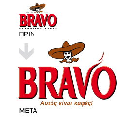
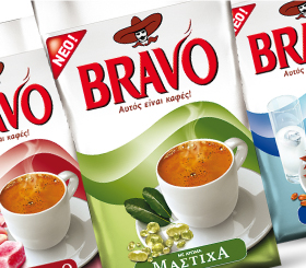
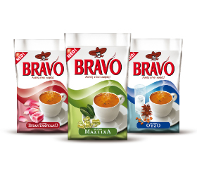
The Solution: The re-branding program started by defining the visual cues that had equity in the current packaging. Specifically, the logo and the silver color, the color of Classic, the core SKU. The attributes of excellent quality and aroma were the drivers of the re-branding program. Color A comprehensive color study was completed. Brandessence / CBX recommended the use of the silver color across all SKUs and variant color coding per SKU. In this way, the Bravo brand would achieve differentiation on shelf and among the various SKUs. Logo Although not part of the original brief, Brandessence / CBX recommended the careful revitalization of the logo. The Bravo logo was revitalized to communicate aroma and stature through the stylized V. Packaging A wave of aroma was developed graphically and “dressed up” all packaging. While important coffee category cues were represented on pack (for example, product depiction) the packaging was completely revitalized, to communicate dynamism and modernity.