Bank Of Chania - Corporate Identity Revitalization
The Challenge: The Cooperative Bank of Chania in the island of Crete in Greece, has been rapidly expanding to other provinces and Greek cities in the mainland. Along with the rapid expansion, came the realization that the Bank’s current corporate identity must be revitalized. The Cooperative Bank of Chania requested from Brandessence / CBX the development of a new corporate identity. Part of the corporate identity program was the evaluation of different name options. The Bank was concerned that the current name, which is linked to a specific city, may hinder their expansion efforts.
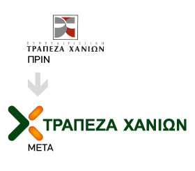
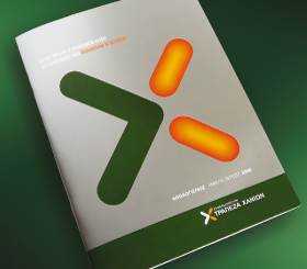
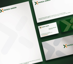
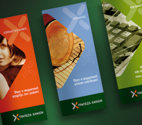
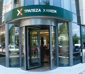
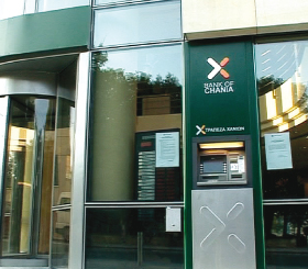
The Solution: A. Brand TriangleTM Development The first step in starting the branding program was to develop the Bank of Chania, Brand TriangleTM. The Brand Triangle identifies the brand’s 3 most important values. The 3 core values of the Bank of Chania brand were identified as friendly, reliable and dynamic/expanding. Specifically, the attribute of friendliness is very important to the Bank since it translates its nature (a cooperative bank) in a customer appealing manner. Banks in Greece are not perceived as friendly. The real attribute of cooperation offers to the Bank of Chania a significant competitive advantage. It was therefore critical to communicate the attribute of cooperation, on the bank’s branding, and position it in a differentiated manner against the competition. The attribute of reliability is very important in the banking category. Any re-branding effort should communicate the stature and safety the Bank offers. Finally, the Bank’s rapid expansion and dynamism was the important third attribute and the very reason for the re-branding program. B. Name development Brandessence / CBX’s recommendation was not to change the name. From a branding point of view we believe that name changes of strong, healthy brands should be carefully studied. As it was proven, after conducting research, the current name had no negative connotations and customers from different provinces and cities were driven to the Bank due to its brand awareness and strong image, not hindered at all by the Bank’s name linking it to specific city. C. Corporate colors The bank’s initial colors of grey and red did not help the bank build a strong identity, or brand visibility in the retail world. We thus started, with a color study of the competitive environment. It became apparent that the color green was underutilized and thus, appropriate to build a strong brand identity in the banking category. In addition, the color orange was added to enhance brand visibility and communicate warmth and friendliness, a key attribute for the Bank of Chania. D. The Corporate Logo A new logo and corporate identity were developed. The new logo was derived from the letter X which stands for the sound Ch in Greek, for Chania. The new logo is a forward moving arrow, connoting the bank’s growth and dynamism. The new logo is simple and dynamic. Although it’s an arrow, it also represents the letter X and is a continuation of the bank’s previous corporate logo. E. Corporate Identity Applications A number of corporate identity applications have been developed to bring the new identity to life and to develop a consistent brand image. Signage for the bank’s new building and all its branches, ATM machine design, product brochures, folder etc were also designed. The new identity for the Bank of Chania, is simple and unique and communicates the bank’s core values.